One impossible sky,
seen everywhere.
Valdo Games came to us with Orbitfall, a physics puzzler about pulling planets out of orbit, and a launch date nobody outside the studio cared about. Yet.
- Client
- Valdo Games (fictional)
- Scope
- Launch campaign, key visual system, landing experience
- Timeline
- Fourteen weeks, teaser to launch day
ChallengeNobody preorders gravity.
Orbitfall is a quiet, cerebral game in a genre the internet screams past. The studio had no audience, no publisher marketing budget line, and a launch window sandwiched between two franchise releases. The brief we wrote together: make strangers feel the game's one magic trick — moving something enormous with one finger — before they ever see gameplay.
Conventional key art would have buried it. Screenshots read as generic space. The campaign needed an image that felt like the mechanic: massive objects, casual disobedience of physics, total calm.
ApproachBuild the sky first.
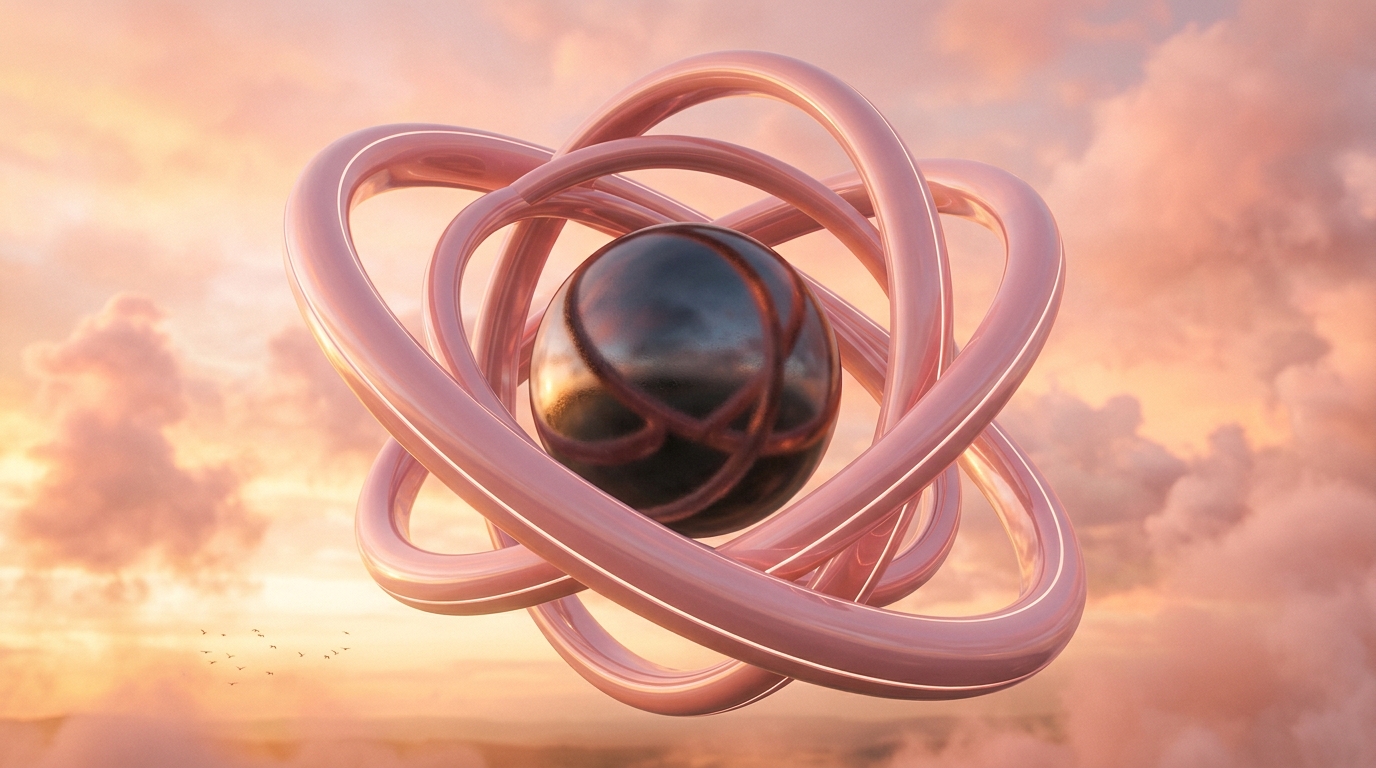
We designed a single campaign world instead of a set of assets: a peach dusk sky where glossy rings the size of cities idle above the clouds. Every deliverable — teaser film, landing page, social suite, out-of-home mockups — was a different camera pointed at the same sky, so each impression compounded the last.
The teaser arc ran three beats over six weeks: an unexplained ring on the horizon, a hand-scale gesture that tilted it, then the title. The landing page carried the same restraint — one scroll, one interaction, a wishlist button that behaved like the game: drag the ring, release, and it settles into place as the form submits.
Launch week flipped the palette to night across every channel at the same hour, a synchronized costume change that cost nothing and read as an event.
OutcomeLoud day, chosen.
The quiet puzzler had the loudest day in the studio's history, and the campaign world keeps working as the game's permanent visual identity — season art, patch notes, merch, all one sky.
Illustrative results. Fictional demo — Valdo Games and Orbitfall do not exist.